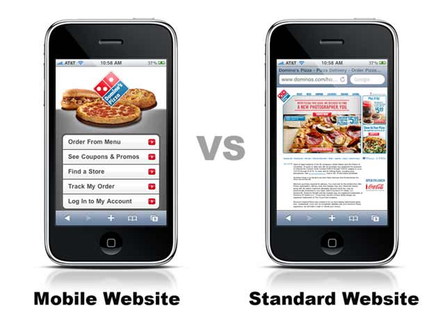
Mobile Website Design
In today’s world, smartphone and tablet usage is growing at an exponential rate. Almost everyone has a smartphone, which means that if your website is not optimized to be displayed on a smartphone, you could be missing out on reaching your local customer at a crucial moment in their buying process.
For example, they could be standing in your competitor’s store, deciding on whether to buy a product or not. Their decision may be hinging on whether your store has it at a cheaper price. If your website isn’t mobile friendly, they may never find out and buy that product at your competitor’s store instead!
Why mobile is more important than ever.
We have known for a long time that Google has been focusing on creating a better experience for mobile users. They confirmed the importance of mobile with their implementation of Google AMP – Accelerated Mobile Pages.
While this change is mostly for large-scale publishers, it is important to everyone as it is training mobile users to expect a high-quality mobile experience. Mobile users are going to expect every website to load instantly and be easily legible on any screen sizes. Websites that do not fit the bill will likely be abandoned.
How we make website designs mobile friendly.
Gator SEO knows what works in terms of mobile friendly design. That is why we use WordPress combined with a responsive theme. Google Developer Resources recommends responsive design as the way to create mobile friendly websites because it creates a similar user experience across all devices and it keeps all of your website content on the same URL.
Responsive design is also great for your local business, as it will allow you to show the same content to mobile users as you show to desktop users. For example, if you are collecting email leads on your website in your sidebar with a simple name and email address form, that same form will appear on mobile devices as well. The difference is that it will appear below the main content instead of to the left or right of the main content.
We also know the tricks of the trade in terms of local search optimization and mobile friendliness goes hand in hand. That’s why we won’t put your address or phone number in an image file – because we know that not only does it make it harder for you to rank in local search in your area, but it also hurts your chances of people calling you on the spot from their mobile browser or copying your address and pasting it in their map for directions.
Is your website mobile friendly?
Now, it’s time for a gut check. Take out your smartphone and lookup your own website and ask yourself.
- How long did it take your website to load?
- Can you easily navigate to all of the important pages?
- Is your most important content easy to read?
- Can you click on your phone number can call your business?
- Can you easily fill out your forms or make a purchase?
If you are not satisfied with the answers to those questions, then contact us. We can help ensure that your website is mobile friendly so that you don’t miss out on any more local business from mobile users!
